Analyzing open data with DuckDB

When I started writing this blogpost a few weeks back, I was planning to look into DuckDB and write about it for maybe a couple of hours, and see where that got me. Something close to 30 hours of work later, I'm clawing myself back up from a very deep rabbit hole, and I don't know how to introduce this blogpost properly. See, what happened, was that I discovered data.entur.no while looking for some meaningful data sets to apply DuckDB to. In there, there's a data set with arrival times, departure times and scheduled times for most of the public transit in Norway.
I love analyzing big event tables like this. I almost can't help myself. There's so much to learn!
I've been taking the bus to work for many years, and I prefer to take the train whenever I need to go to Oslo, about once a month. I use a lot of public transport and was curious to see if I could use this data to find out where delays actually happen, where they are caused. When I'm waiting 10 minutes for a bus, it's because the bus got delayed earlier in the route. But where? How? Why? I was curious to find out if there were predictable patterns.
Making a map
Long story short, I made a dashboard to make that kind of investigation a little bit more accessible (hopefully). It's available at kollektivkart.arktekk.no. Go on, take a look, this blogpost will wait.
Back? If you still have some more time to kill, I've written about the how and why below.
Big data is dead
In the original introduction, I meant to motivate why I find DuckDB so interesting. I set up a git repository with uv and started writing a Jupyter Notebook.
The notebook was meant to be short. It's not.
It was also meant to become a blogpost, but I think it's way too long and detailed. I want to briefly summarize the introduction here:
- While it could be true that big data is dead, big data has also led to lots of exciting innovations that empower everyone who owns a modern laptop to be able to analyze much bigger data sets than 5–10 years ago. Much bigger than you probably think. DuckDB is one of these innovations.
- I hope that DuckDB can replace spark/pyspark for my personal needs. I really like that it's usable with JDBC, the Python DBAPI, Jupyter, Rust, node, the browser (wasm), and many more. It's also a portable storage format for sending data sets, much like sqlite.
- I couldn't help myself and had to take a dig at big CSV files.
- It goes on to document how to get data out of BigQuery and into DuckDB.
I set up and downloaded data from the Entur Real-Time
big query table
and loaded it into DuckDB in Jupyter. Amazingly, the 214 million rows and 19 columns of data
that I downloaded was easy to work with on my laptop. Snappy, even. Basic GROUP BY
aggregations on 214 million rows takes only a few hundred milliseconds.
Investigating delays
I did a lot of simple aggregations to check whether I could identify patterns to delays. Here's one example, this query gives me the average delay in seconds for buses arriving at Nidarosdomen, grouped by the year, month and hour of day:
select
  mean(extract(epoch from arrivalTime - aimedArrivalTime)) as delay_seconds,
  extract(year from arrivalTime) as year,
  extract(hour from arrivalTime) as hour,
  extract(month from arrivalTime) as month
from arrivals
where stopPointName = 'Nidarosdomen'
  and abs(extract(epoch from arrivalTime - aimedArrivalTime)) < 1800
group by 2, 3, 4
It identifies all 2 816 908 registrations at Nidarosdomen, from the 214 million data points, groups them and takes the average in 0.615s on my machine, returning 1329 rows.
It is easy to pull results out of DuckDB to visualize them, and as a result, there are many figures in the notebook.
Eventually, I found a type of figure I thought was really useful in order to understand where delays happen. I focused on the time from one stop to the next stop and looked at a roundabout near Lerkendal. One that sometimes frustrates me when there's a lot of traffic, and I made this:
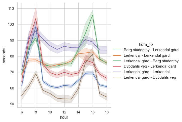
Once I had made that figure, I realized I wanted to offer other people to investigate rushtime effects on delays. Maybe there's someone who can use this sort of information to improve something?
Planning a webapp
This is where the real scope creep set in. Up until this point, I had only meant to make a few neat figures and a blogpost. Now, I immediately wanted to make a map showing all the stop-to-stop legs. I wanted to let people easily go from the map, to looking at the rushtime effects in detail near where they live. I decided to try making an interactive webapp. Here's the list of activities I wrote down for myself right away:
- Understand the data well enough to produce interactive visualizations that are useful.
- Predict which queries I needed to run to back the visualizations.
- Set up programs to run all the queries with reproducible results.
- Set up inexpensive and convenient storage for the query results.
- Write a webapp/dashboard.
- Set up hosting for a backend—the data files were too big to send everything to the frontend.
For the last two points. I realized I needed to pay for some hosting, but I wanted to go for a european provider due to recent international events. This ended with me doing lots of research to find something where I could just push a docker image on the cheap, but I didn't find any good options for that. I did discover that Europe has great deals on inexpensive object storage, and resigned myself to setting up a linux server. This ended up being a pretty good idea, I will save some money when I move my other hobby projects out of my current hosting, and it's not much added inconvenience these days.
Doing the work: Refining data
I timeboxed the first two points about understanding the data and predicting the queries. I decided to set aside three afternoons for that to see if I could get something promising. This ended up being a pretty good idea. Now that I have the scaffolding for everything done, I could see myself improving the queries. There are two expensive queries doing most of the heavy lifting:
- The query that joins each arrival at a stop, with the arrival at the next stop. This makes it possible to calculate distance between stops and figure out timestamps in relations to each other. This produces a massive result set and is not suitable for loading into a browser.
- The query that aggregates the output from the first query into a small result set showing things like typical travel time between two stops.
These both take a few minutes on my laptop. Not long enough to brew a cup of coffee, but long enough to get distracted for a little while. Not a problem, once they're done I can work for a long time on their output.
I will want to improve the first query quite a bit, it throws out much more data than necessary. Once the second query has run, it is quick to get averages, medians or percentiles. The result is also small enough to fit into memory on a modest virtual machine. That enabled me to build a backend that just loads all the data into memory on startup, eliminating both the need for a database server and any IO that comes with it.
Doing the work: Reliably producing and storing output data on the cheap
I made some pretty basic scripts for producing these data files, starting with downloading raw data from BigQuery and refining it into small parquet files suitable for just packing into a docker image.
I chose to go with Hetzner Object Storage, setting up a storage account in Helsinki. This is S3-compatible, so it works well with tools I'm already familiar with. It is slightly more expensive than some of the alternatives I looked at, but the price includes a lot of egress bandwidth (1TB/month), and additional bandwidth isn't too expensive. They also had great prices for servers, and I wanted to avoid having to set up more than one cloud provider for this tiny project.
I uploaded these parquet files to my object storage (you can click the link to download, they're quite small):
- leg_stats.parquet are aggregations on the stop-to-stop level, for delays, deviations from schedule and actual durations. It also contains air distance in kilometers, so we can calculate average speed and such.
- stop_stats.parquet are aggregations on a single stop, such as the count of transits passing through per hour.
- stop_line.parquet lets me find out which transit lines that visit which stops.
I just run the scripts to produce the data on my laptop and upload the results. It's not a data platform, but it'll get the job done for something like what I'm working on!
Doing the work: Writing a webapp
As a part of my exploration, I was playing around with plotly.express.scatter_map in a notebook, and I liked the result I was getting. I haven't written a lot of JavaScript these 7 years or so, so it's a big advantage for me that I can lean on the language I used for the rest of the project. So I settled on writing the app in Python, which I know quite well.
I wanted to try out streamlit since I've got no prior experience with it. Then, I realized I already had no prior experience with DuckDB and I had already committed myself to also setting up a server. Since I've got some experience with dash and I knew it could get the job done, I went with that instead.
The app just loads the three data files into an inmemory DuckDB on startup; it assumes they're in the working directory. It was quick to get a basic map up. I essentially just had to copy it out from a notebook, with code that essentially looks like this:
fig = px.scatter_map(
    df,
    hover_name="leg",
    lat="latitude",
    lon="longitude",
    size="clamp_mean",
    hover_data={
        "clamp_mean": False,
        "mean": True,
        "count": True,
        "rush_sensitivity": True,
        "10% percentile": True,
        "25% percentile": True,
        "50% percentile": True,
        "75% percentile": True,
        "90% percentile": True,
    },
    color="rush_sensitivity",
    color_continuous_scale="viridis_r",
    zoom=11,
    center=dict(lat=lat, lon=lon),
    title=f"...",
    height=800,
)
df refers to a pandas.DataFrame containing the result set of a somewhat gnarly DuckDB query:
SELECT
    previous_stop || ' to ' || stop as leg,
    map_lat as latitude,
    map_lon as longitude,
    count,
    (struct_extract(stats, $choice))['mean'] as mean,
    greatest(1, (struct_extract(stats, $choice))['mean']) as clamp_mean,
    (struct_extract(stats, $choice))['min'] as min,
    ((struct_extract(stats, $choice)).percentiles)[1] as "10% percentile",
    ((struct_extract(stats, $choice)).percentiles)[2] as "25% percentile",
    ((struct_extract(stats, $choice)).percentiles)[3] as "50% percentile",
    ((struct_extract(stats, $choice)).percentiles)[4] as "75% percentile",
    ((struct_extract(stats, $choice)).percentiles)[5] as "90% percentile",
    (struct_extract(stats, $choice)).max as max,
    least(3, round(
        (stats.actual_duration.percentiles)[4] / median(
           (stats.actual_duration.percentiles)[2]) over (
           partition by previous_stop, stop, year, month
    ), 2)) as rush_sensitivity
FROM leg_stats JOIN stop_line using (previous_stop, stop, year, month, hour)
WHERE year = $year
  AND month = $month
  AND hour = $hour
  AND lineRef = $line
You can see how the px.scatter_map call just refers to columns in this result set. We
use the lat and lon parameters to place a circe of radius clamp_mean in the right
spot, and color the circles according to rush_sensitivity. We name the circle by its
leg column, and on hover, we show detailed stats. center allows us to center the
map, I've set those variables to a point elsewhere.
The struct_extract(col, field) is DuckDB syntax for working with structs. The stats
column is a struct with three fields, which are structs themselves: delay, actual_duration
and deviation. Since these have the same layout, it is easy to expose a $choice
parameter to the query, making it an interactive element.
After iterating on the webapp for an afternoon and half a saturday, I figured I had something worth showing. It's still hackathon-quality code. But I think maybe the potential is there that people will find it interesting and start to think about what other questions we can ask this data.
This part of the project was pretty fast, I took lots of shortcuts when making the dash app (there's no structure and lots of copy-paste). I may rewrite it now that I'm more familiar both with dash, and what I actually want to visualize. I chose to use no time in styling it. I don't think it's necessary to get the point across, and I can't do it quickly (and possibly not nicely either, I'm not sure).
I wanted to deploy the app as a docker container, so I needed to produce an image to someplace my server could access it. Since I don't need to hide the source code or the image, ghcr.io seemed fine. I made a tiny GitHub workflow that downloads the data files from object storage and a Dockerfile that ADDs them and installs the app, and gunicorn.
I wrote a local docker-compose file and verified that I could run gunicorn --preload
with several workers without using excessive amounts of memory (this is because fork()
gets copy-on-write pages from the parent process memory).
Doing the work: Getting it deployed to the internet
I had already chosen Hetzner at this point. Somewhat arbitrarily, I went with a CX32 instance with 4 VCPUs and 8GB RAM. This costs around 7 euros per month. I hope it'll be generous enough to host my other hobby projects too, it probably will be.
This was Sunday afternoon, and I had decided that I wanted to be able to show something to friends and colleagues by the end of the day. Therefore, I didn't want to pay the startup-cost of researching how to set up puppet or ansible, and instead wrote a copious log of how I configure the server here.
If I keep the server, I will almost definitely write ansible configuration for this instead. I hate the possibility that I couldn't reproduce the setup. But I'm also kind of sick of YAML, and I haven't been friends with puppet since 2017 or so. I decided to pay a little bit extra to Hetzner for backups and snapshots, just in case I never get around to doing this.
I set up nginx as a reverse proxy, and made a docker-compose.yml on a dedicated linux user for the webapp. I wrote systemd setup for docker-compose.yml so that everything will come back up after unattended reboots. I enabled unattended reboots after installing packages. Hopefully this means I don't have to check in on the server too often.
Did we learn anything?
I've learned so much from this. I want to focus on DuckDB first:
DuckDB
There are some fantastic conveniences in this SQL dialect. If you're comfortable with the postgres dialect, you don't need to study anything to get started. But here are some nice tricks I found.
You can place the FROM first:
FROM arrivals
  LEFT JOIN quays ON arrivals.stopPointRef = quays.id
SELECT 100 * mean((quays.id is null) :: double) as missing_pct;
You can GROUP BY ALL to group by every column that isn't an aggregate:
FROM arrivals
SELECT extract(year from arrivalTime), extract(month from arrivalTime), count(*)
GROUP BY ALL;
You can SELECT * EXCLUDE(...) to get "all but" some columns:
FROM stop_stats
SELECT DISTINCT * EXCLUDE(stats);
It is very convenient to write topN queries:
FROM STOP_STATS
SELECT MAX(stats.delay.median, 10); -- top 10
You can also query directly against data files over HTTP, even in the browser.
Go to shell.duckdb.org and try this one:
FROM 'https://kaaveland-bus-eta-data.hel1.your-objectstorage.com/leg_stats.parquet'
SELECT previous_stop, stop, air_distance_km, stats.actual_duration.median AS duration
WHERE YEAR = 2025
ORDER BY duration desc
LIMIT 5;
There are many more on the Friendly SQL page.
Entur open data sets
The data sharing that Entur has set up at data.entur.no is fantastic for power-users. There's a barrier to entry from having to set up a project in Google Big Query, but it is incredibly flexible once you've done that.
The data sets seem overall to be really high quality. There's no doubt to me that this data can be used to answer lots of questions that people should have. Here in Trondheim, the electric vehicles were thrown out of the bus lane last fall. I heard lots of hearsay about the effects of that. We should be making it easy for an inhabitant to figure out what kind of effect this had on their commute, regardless of where they live. I think this data can be used to answer that kind of question.
I really like studying big event tables, so I'll almost certainly be doing some more work on this data once I've had time to let this little project sink in.
European cloud providers
A lot of things have happened in this space since I last looked at my options, around 2018.
I think these are some really promising providers to look at:
These all seem easy to get started with, and there are managed kubernetes, managed databases and private networking available. I've been happy with OVH in the past, and Hetzner seems really nice, and cheaper.
For the public sector and big companies, I guess I could see IAM being a big hurdle here.
Deploying with docker-compose on a virtual machine in 2025
I feel like this is much less annoying than it used to be. The machine is practically empty,
it only has nginx, certbot and a docker engine installed. Since I don't need to deal with
any secrets for my application to work, I can push put everything I need into the image
on a public registry. All I have to maintain on the server is a docker-compose.yml. It'll
be interesting to see how that works out in the long term.
The place of LLMs in this exercise
The LLMs are stuck in the past. For software like DuckDB and dash, that have made changes
in the past 2 years, they are of limited use, unless you stick with old versions. Both
Claude, OpenAI o1 and Le Chat refused to tell me about plotly.express.scatter_map, they
just don't know about it, and would rather I keep using the old plotly.express.scatter_mapbox.
They will happily insist that a lot of SQL that DuckDB accepts is invalid and unhelpfully
correct it. I was unable to productively use LLMs for the webapp and SQL queries both.
o1 led me down a pretty terrible path for paging through the result set of BigQuery that cost me 1–2 hours of getting it right, only to discover that it was slower than the naive approach I had written myself before I asked it for help.
It was wonderful to spar with o1 and Le Chat about configuring the server. I had a pretty clear idea of what I wanted to achieve, and it felt like they both contributed good ideas to get it done efficiently. I had a pretty clear plan about what to do when I purchased the server, in large parts due to having access to quickly quality check my ideas.
Future work
Once I've had some time to let my head rest, I'm probably going to pick up the webapp again and improve it. In particular there's a lot of potential for confusion about what the various numbers and statistics actually mean. It was very hard for me to try to formulate clear descriptions. I've set up some issues for myself at the issue tracker.
It may also be interesting to see if I could make something work on the national scale, instead of just Trøndelag county. 🤔
Thanks for reading!
